| 4329
Grassmere - The Interiors
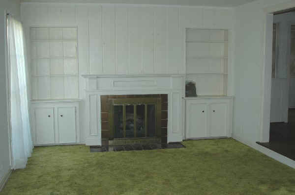
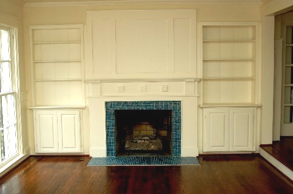
This 1940 house had a 70's makeover that was begging for a redo. Below are some before and after photos. Living Room before and after
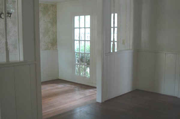
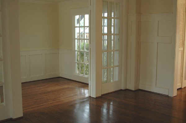
Dining Room before and after
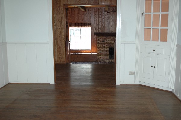
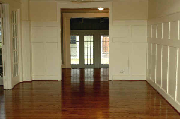
Study before and after
Open doorway and half walls were replaced with french doors that can be closed.
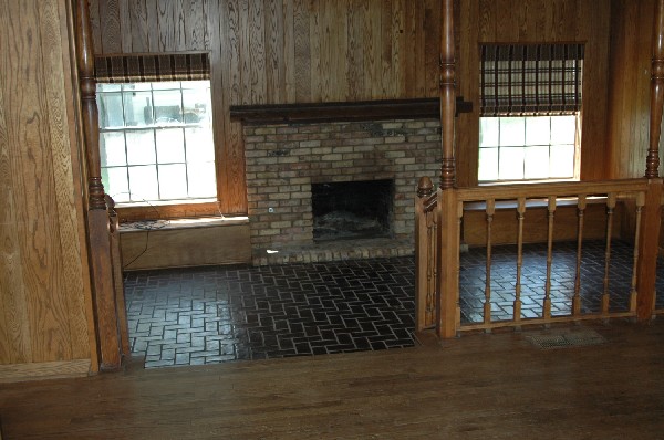
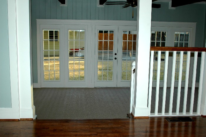
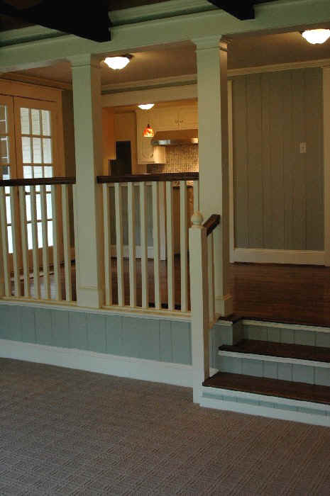
Family Room before and after
The first three days of renovation were spent taking down a 1970's chimney to replace with french doors. The room was still grungy looking due to the dark oak walls and ceiling. The initial thought was to replace the oak with sheetrock. But the thick oak planks were too nice to discard. So we lightened up the room by painting the walls a greyish blue (Silver Sage), and left the brown ceiling alone to complement/contrast the blue.
The original country style columns turned out be load bearing, too risky to take out. So we enclosed them to form new columns. Turned out great.
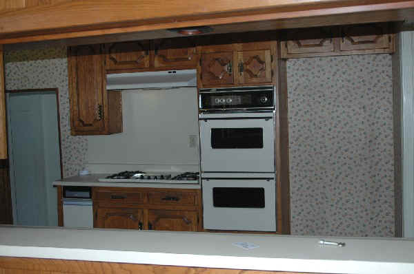
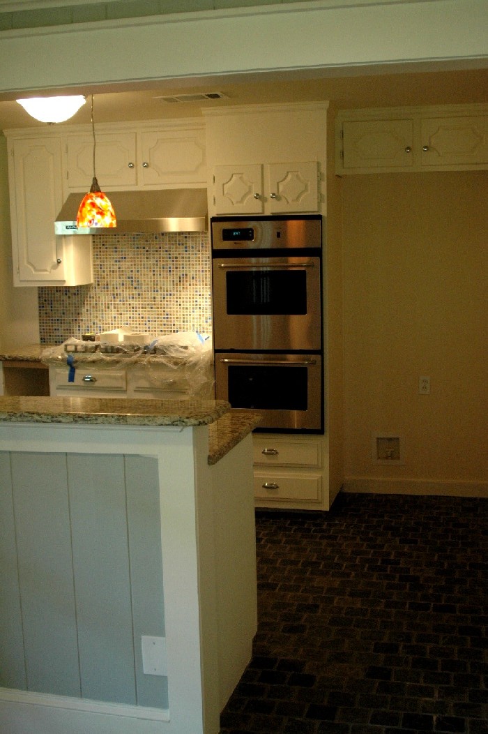
Kitchen before and after
The 1970's cabinets were solid oak and were in good shape so we just painted them. We also cut out a walkway to have a direct path between the kitchen and the family room.
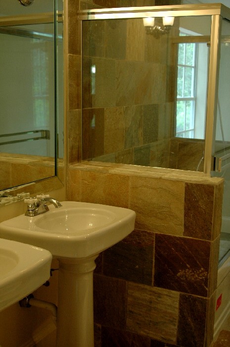
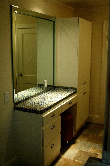
This house was on the market for over a year when we bought it. It scared off buyers with a very chopped up layout and had no master bath as result of the various remodels/expansions over the years. The house was also overran with a 1970's version of Early American rustic look (dark oak walls, turned columns, green shaggy carpets). It was just unattractive through and through. We bought the property anyway because the house was structurally sound and the exterior had an old-time elegance new constructions can't seem to match. First thing we did was taking down a large 1970's chimney that blocked the views to the rear yard, replacing it with a wall of french doors. Then we took down walls and widened door ways to open up and reconfigure the interior spaces. Also added a new master bath and an upstairs game room. In the process, the house's 5th bedroom was sacrificed. But the resulting layout is much better. We also banished the 1970's rustic look to redo all the millwork in the Vernacular Revival style popularized by Florida's Seaside. We added a lot of woodwork, but thanks to the understated elegance of vernacular styling, the house is warm and inviting as opposed to being ornate and pretentious. Another thing with this house's clean-lined millwork is it will host well a wide range of decorating, from traditional to contemporary. Me, I'd have fun furnishing this house with Barcelona chairs and Warhol and Rothko paintings to make it look like something out of Metropolitan magazine. Some more photos. The master bath we added. Kohler fixtures. Jacuzzi tub. East facing window for morning sun. Makeup table has jewel tone mosaic glass tiles.
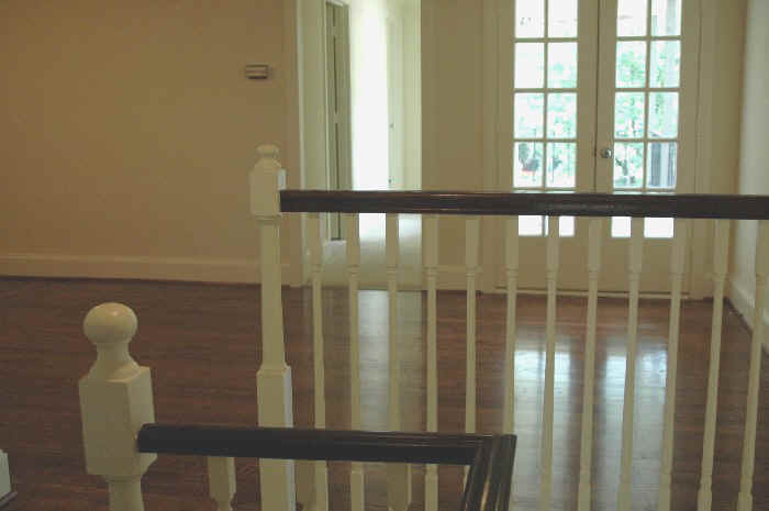
The upstairs playroom we dropped a couple of walls to make space. Where the kids can make all the mess they want. Spacious enough for a ping pong table. Also made the space open to the stairwell to add light, improve sightlines.
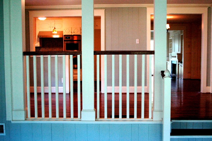
Another view from the family room (back of the house) towards the breakfast area and kitchen.
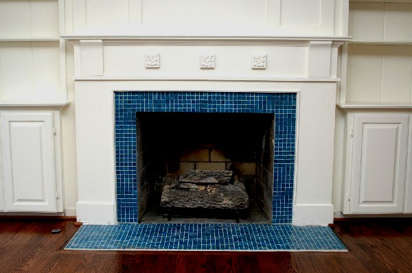
A closer look of the fireplace.
|